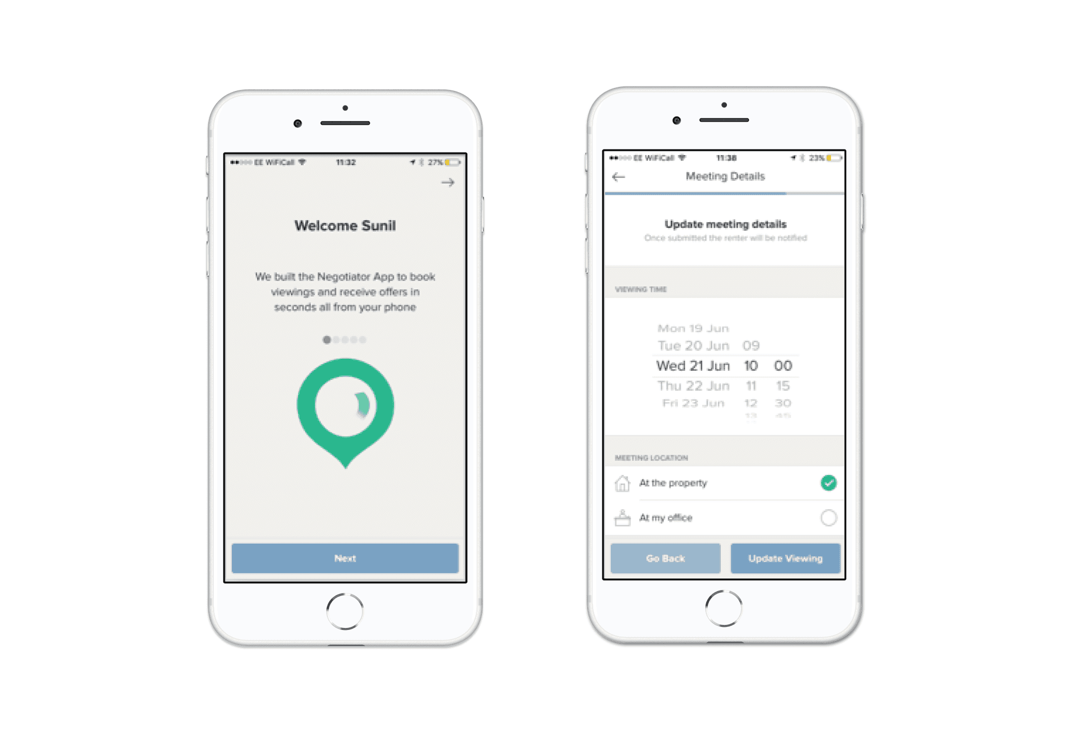
Movebubble is a property rental platform designed to simplify the process of finding and renting a home. It connects renters with available properties, offering a user-friendly app that allows users to search, view, and secure rental properties directly from their mobile devices.
Role:
UX Designer
Industry:
Proptech / Real Estate
Duration:
3 months
Challenges
Movebubble manually books viewings for renters via phone calls to the estate agents. In order to maintain this a team of bookers is needed to arrange the viewings. This can take some time to book and in that time the renter requesting a viewing may go offline and call the agent themselves. As a startup this is not sustainable and will not allow the business to grow.
If we create an app for estate agents to pick up viewing requests directly from our renters, then renters will get a faster responses from agents and in turn agents will be able to process renters more quickly. This is will also reduce operating costs on the business.
My Approach
Discovery Phase
I had to understand the day to day for an estate agent to really understand what our app could do for them. Initially I proposed embedding myself into an agency conducting ethnographic research to observe and shadow agents in their workplace and on viewings of properties. As this would have taken quite a bit of resource, time, and contacts as a business we decided not to go forward with this but rather I watched new agent onboarding videos and interviews found on youtube and career sites to get a better understanding of what each day looked like as an agent. This helped create my first set of personas.
From the research I had found that agents tend to try and qualify each renter and don't let every enquiry through, they'd also ask for specific information as they'd need to add it to their CMS in order to book the viewing.
Design and Development
Lean approach to designing rapidly. Initially on paper then in keynote for prototyping, then in Sketch.
CTO build the app from designs and had it ready in Testflight.
Our operations team had been busy making contacts and we joint forces to arrange a drinks evening for 20+ estate agents in London to come see what we had been up to and to also test our prototype with them. We also used this time to gather insights into what would help them in their day to day and delve into wish-list features/benefits they might want for the app.
Results
We launched the app shortly after the in-person session to a select group of estate agents around London.
I went out with the sales team to onboard agents in person and gathered more insight each time.
This led to vast improvements and experience our set of agents had with the app.
Future Plans
Over the year I continued to refine and add features to the app but as I had created this as a prototype the UI was not in line with our renter facing app and brand.
In my own time I worked on adapting our renter facing design standards to include UI for the agent app also. I redesigned the app from the ground up and pitched it to our head of product, it got the green light and was added to our roadmap to be developed some time after.
Conclusion
From the initial sketches the app grew beyond just booking viewings, it also allowed for profiles, contextual chat with renters, as well as many other features. I used both qualitative and quantitative research to help improve the app and inform new design. I learned how to use SQL and some basic python to work with our data scientist to identify experiences in the app that could be improved that might not have been identified otherwise.
The app became an integral part of the Movebubble experience and achieved its goals and more.


